
How big can I print?
The tables show the image quality expected from various camera resolutions. These figures assume that you will be using the entire image without cropping as cropping will reduce the final file size.
Note also, newer cameras often have better lenses and processors which can also improve image quality over older models with similar resolution.
- 8MP - iPhone 5, 6, Galaxy S4, S5
- 12MP (Recent Models) - iPhone 6s, 7, Galaxy S6, S7
- 12MP (Current Models) - iPhone 8, X, Galaxy S8, S9, S10
A0 (1189 x 841mm)
| 8MP - Good |
| 12MP (Recent Models) - Good |
| 12MP (Current Models) - Great |
A1 (841 x 594mm)
| 8MP - Good |
| 12MP (Recent Models) - Great |
| 12MP (Current Models) - Great |
A2 (594 x 420mm)
| 8MP - Good |
| 12MP (Recent Models) - Great |
| 12MP (Current Models) - Great |
What file types do you accept?
We accept a range of different formats: JPEG (JPG), PNG, TIF, PDF. These are the formats we recommend:
- For photos: high resolution JPEGs (preferably uncompressed)
- For graphics or text: vector based PDFs
- For a mix of graphics and photos: PDFs
What is the difference between vector and bitmap images?
A bitmap (e.g. JPEG, PNG, TIF) is made up of thousands of tiny squares or 'pixels' which are all the same size. The number of pixels in an image is called 'resolution'. When an image looks sharp or photographic it has a high number of pixels and it is a 'high resolution' image measured in pixels per inch (PPI). When there are fewer pixels an image will look soft or 'pixellated'.
As bitmap images have a set number of pixels, they will lose quality when enlarged. It is, therefore, better to send us 'high-resolution JPEGS'. A vector image uses coordinates to plot each point on a line or curve. This means that vector images can be enlarged while maintaining quality. Save graphics, text and line art as 'vector based' PDFs. This is possible in applications such as Adobe Illustrator, InDesign and Photoshop.
Bleed and trim set-up guide
At PosterFactory we print to the edge of your specified page size. To get the best possible results, we suggest setting up your print file with 3mm of bleed (extra image) on all sides of your print. Trim marks are usually set outside of the bleed area. Note: Image bleed is extra image or background colour extended beyond the print area. Adding extra white does not constitute bleed.
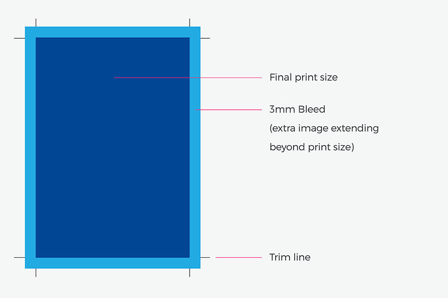
If you are unable to provide bleed or trim marks, make sure that any text or important elements are not too close to the edges.
Can’t do trim marks?
If you are unable to provide bleed or trim marks, we print your file slightly larger (creating 1-2mm of bleed) then trim off the excess to the correct finished size. As such, make sure that any text or important elements are at least 6mm away from the edges so they don’t get trimmed off.
Extra border for framing
PosterFactory prints and cuts your file to the specified print size ordered. If you want extra borders for framing purposes, please include this in the overall print size.
For example if you would like an A3 print (297x420mm) but would like an additional 10mm on each side, you will need to set up and order your print size at 317x440mm.
Note: If you want a white border, include the required amount within your artwork file. If your file has a white border or white area around your image, your file will be printed with the white border or white area included.
Image Colour Mode
For the best possible colour reproduction we advise you to supply images as RGB files. RGB files print with a larger colour gamut than CMYK files. Images should also be saved with their respective RGB profiles. Most web based or camera captured images will have sRGB or Adobe RGB profiles and differences may not always be noticeable. However there are a number of less common image profiles that may cause colour issues if the profile has not been embedded.
How to avoid my image printing too dark compared to my screen?
There are a number of things that you can do to prevent this happening even when working with an uncalibrated screen. First, lower the brightness of your screen so that brightest part of your screen (white) has the same level of brightness as a white piece of paper. Once you have done this have a look at your image on a white, grey and black background. Reduce the image size on screen and review the image at a matchbox size (app 30x 40 mm ). Now adjust your image until you are happy with it whilst viewing it in each of the above scenarios and be assured that your printed result will not be too dark.
Our resolution guide
The recommended resolution for printing posters from A2 to A0 is a minimum of 72ppi at final output size. Higher resolution files are the best. The following sizes are a guide to pixel resolutions required for various print sizes. Before uploading your image, check that your image resolution is high enough for the size of print that you require. For more information on our printing services or specs - call us on +61 2 8594 3555.
- A2 (420mm x 594mm) - 1191 x 1684 pixels @72ppi
- 30 x 40” (762mm x 1016mm) - 2160 x 2880 pixels @72ppi
- A1 (841mm x 594mm) - 2384 x 1684 pixels @72ppi
- A0 (1189mm x841 mm) - 3370 x 2384 pixels @72ppi
Checking your image resolution
If you don’t have a dedicated image processing program you can view your image’s resolution in the ways outlined below.
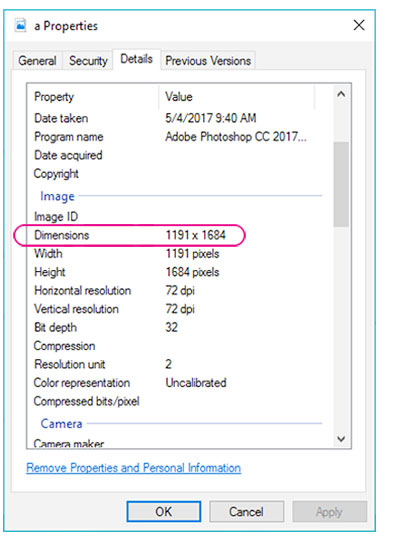
Windows:
Right click on the image file and select ‘Properties’. Select the ‘Details’ tab and scroll down to ‘Dimensions’.
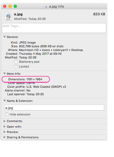
Mac:
Select the image and select File/Get Info. Pixel dimension will be displayed in the ‘More Info’ section.
Will my poster match what I see on my screen?
It will probably end up looking better than you expect. Image quality is our passsion and we have selected the best possible machines to produce your posters. We use Epson printers for truely outsanding colours, clarity and precision printing. We ‘calibrate’ our machines to ensure we exceed the result you are expecting.

Some of my images printed too dark - Why?
When images print darker than expected these are the most likely reasons why:
The screen is too bright (How are you viewing your prints?): If images are viewed on a screen that is turned up too bright it will not give a true representation of the image. Don’t forget that the screen is just a representation of the image and not the actual image. Moving brightness up and down on the screen does not change the image, it just makes a difference to how it looks on screen. A simple way of correcting the brightness of your screen is to make the brightest white of the screen no brighter than the paper you have selected to print to (Whitepoint). Alternatively, turn down the brightness of the screen so it matches the sample print you have had printed as it will give you an approximation of what the image looks like.
Viewing conditions: How are the prints viewed? In professional printing prints are always viewed in a simulated daylight environment . That is approximately 5000 degrees of Kelvin and close as possible to 100 CRI (Colour Rendition index). This viewing area is much brighter than an average living room. Please take your display conditions into consideration when editing an image for print.
Under exposed captures: Cameras are so much better these days that this is less of a problem than it used to be. Learn how to read a histogram and check your images in levels or curves in Photoshop or your preferred image editing program. An under exposed image can most of the times be adjusted to print just fine.
Black point compensation: A screen has approximately 10x the contrast ratio of a print. That difference is most noticeable in dark areas where you can see many more “shades” on your screen than you can in print. A print does not represent the same dynamics in tones/shades as a screen. For this we need to compensate prior to going to print. This used to be called “darkroom skills” prior to digital printing. Dodging and burning is art form that still can be practised in Photoshop or by carefully working with HDR filters. Black point compensation is another an effective way of dealing with this issue. Below is a link to a great video showing how that works. If an image has a lot of information on the left hand side of the histogram the video will show how you can stop those shaded areas becoming too dark or defaulting to black. How much of this work that has to be done depends on the paper. A Matt or textured paper (light absorbing) will require a greater adjustment then a light reflective paper (Gloss). Learn more here.

Barbieri Spectro LFP - Automated reflection and transmission spectrophotometer for color measurement in digital large format printing
In short, if images are printing too dark it is unlikely that it is a paper or a printing issue. All papers at PosterFactory are scientifically calibrated to represent each colour value as accurately as possible on any given paper (ICC profiles). We use the latest Barbieri technology and sophisticated calibration colour software and a dedicated RIP (Raster Interpolating Process) to make sure that every pixel are represented in print as accurate as is technically possible. It makes sure that colour values stay true when a paper has been profiled. Yes, the paper selection will impact on how an image will look but these differences are much smaller than the impacts of some selective edits prior to going to print. Yes, textured or a Matt paper will have less of a dynamic rage than a more gloss stock but regardless of paper selection, an image that is too dark will print dark on all papers.
If the above has left you with some question please feel free to make contact so we can help. Printing should always be fun and rewarding.